7 Bar Graphs
There are so many types of figures that you can create in R (Figure 7.1). I will only delve into one type of figure that I believe is most useful for your case. With this basic skills, you have the foundation to delve deeper into this software if you desire.
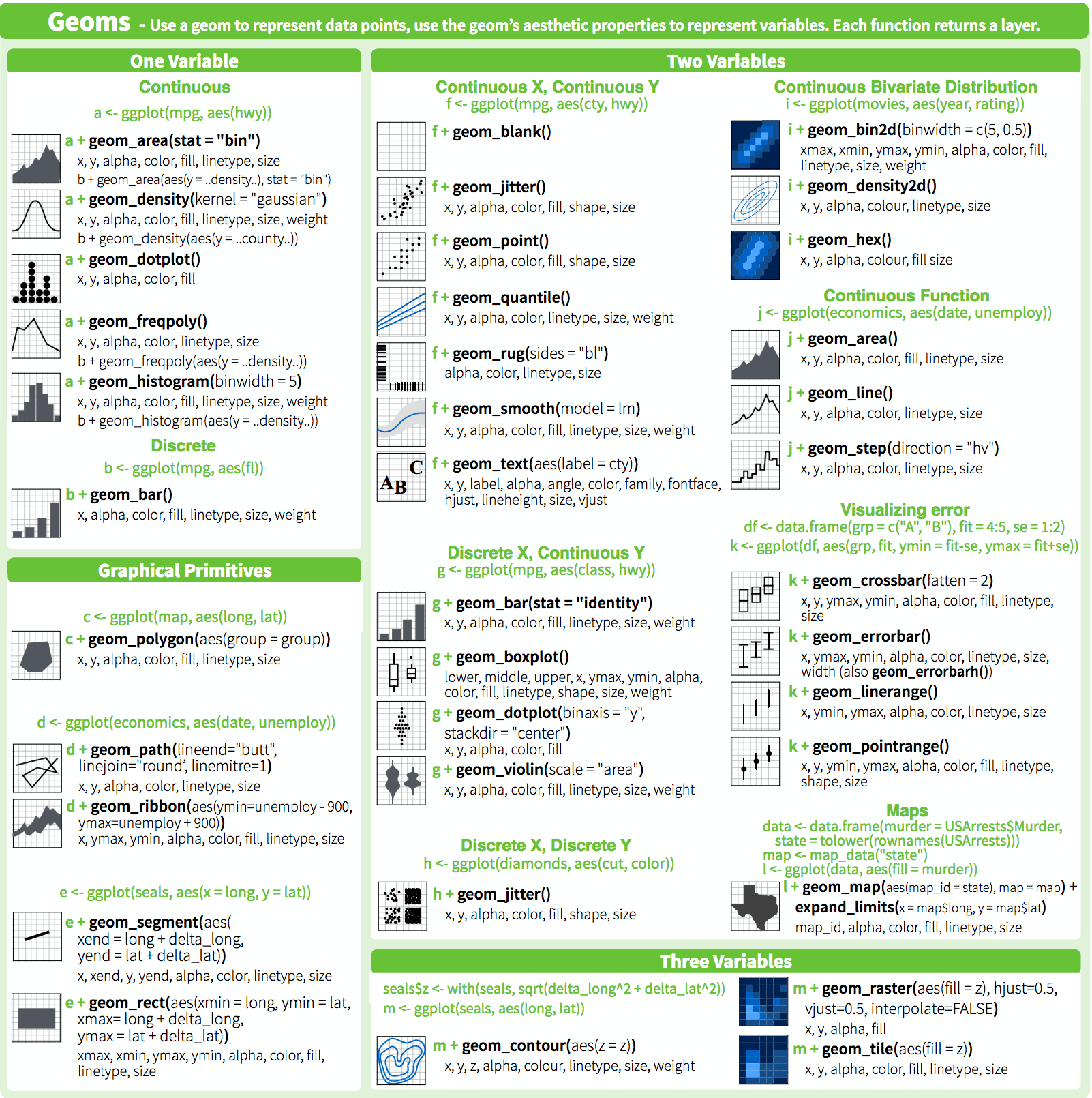
Figure 7.1: The plotting capabilities are endless.
Bar graphs are perhaps the most commonly used kind of data visualization. They’re typically used to display numeric values (on the y-axis), for different categories (on the x-axis). For example, a bar graph would be good for showing the prices of four different kinds of items. A bar graph generally wouldn’t be as good for showing prices over time, where time is a continuous variable – though it can be done.
There’s an important distinction you should be aware of when making bar graphs: sometimes the bar heights represent counts of cases in the data set, and sometimes they represent values in the data set. Keep this distinction in mind – it can be a source of confusion since they have very different relationships to the data, but the same term is used for both of them. In this chapter I’ll discuss always use bar graphs with values.
Let us prepare for this chapter by importing the necessary datasets of groupFMS.xlsx.
# Define factor levels
fct_lvls <- c("squat", "push_up", "hurdle", "lunge", "leg_raise", "rot_stab", "shd_mob")

# Import data
dat_fms <-  read.xlsx (xlsxFile = "data/groupFMS.xlsx")
Group FMS summary table
Let’s create a summary table with three columns, task, score, and Count. This could should be what you have gotten from learning check 6.9.
dat_grp <- dat_fms %>% # original data
  pivot_longer(cols = -id,
              names_to = "task",
              values_to = "score") %>%
  mutate (
    side = case_when(
    str_detect(task, "R_") ~ "right",
    str_detect(task, "L_") ~ "left",
    TRUE ~ "central"
  )) %>%
  mutate (task = str_remove_all(task, "R_|L_")) %>%
  group_by(id, task) %>%
  summarise (score = min (score)) %>%
  group_by (task, score) %>%
  summarise (count = n()) %>%
    mutate (task = factor (task, levels = fct_lvls),
          score = factor (score, levels = c("0", "1", "2", "3")))
#> `summarise()` has grouped output by 'id'. You can override using the `.groups` argument.
#> `summarise()` has grouped output by 'task'. You can override using the `.groups` argument.| task | score | count |
|---|---|---|
| hurdle | 2 | 22 |
| hurdle | 3 | 2 |
| leg_raise | 1 | 8 |
| leg_raise | 2 | 13 |
| leg_raise | 3 | 3 |
| lunge | 1 | 2 |
| lunge | 2 | 21 |
| lunge | 3 | 1 |
| push_up | 1 | 5 |
| push_up | 2 | 4 |
| push_up | 3 | 15 |
| rot_stab | 1 | 6 |
| rot_stab | 2 | 18 |
| shd_mob | 2 | 24 |
| squat | 1 | 15 |
| squat | 2 | 4 |
| squat | 3 | 5 |
Individual FMS table
Let’s extract the row containing athlete c’s data, and make it long.
athlete_c <- dat_fms %>%
  filter (id == "athlete_c") %>% # original data
  pivot_longer(cols = -id,
              names_to = "task",
              values_to = "score")%>%
  mutate (
    side = case_when(
    str_detect(task, "R_") ~ "right",
    str_detect(task, "L_") ~ "left",
    TRUE ~ "central"
  )) %>%
mutate (task = str_remove_all(task, "R_|L_"))| id | task | score | side |
|---|---|---|---|
| athlete_c | squat | 2 | central |
| athlete_c | hurdle | 3 | right |
| athlete_c | hurdle | 3 | left |
| athlete_c | lunge | 2 | right |
| athlete_c | lunge | 1 | left |
| athlete_c | shd_mob | 2 | right |
| athlete_c | shd_mob | 2 | left |
| athlete_c | leg_raise | 1 | right |
| athlete_c | leg_raise | 1 | left |
| athlete_c | push_up | 3 | central |
| athlete_c | rot_stab | 1 | right |
| athlete_c | rot_stab | 1 | left |
Let us also create one more dataset using athlete_c data, and take the lower of the two scores for tasks which are assessed bilaterally.
| task | total |
|---|---|
| hurdle | 3 |
| leg_raise | 1 |
| lunge | 1 |
| push_up | 3 |
| rot_stab | 1 |
| shd_mob | 2 |
| squat | 2 |
7.1 Making a Basic Bar Graph
7.1.1 Problem
You have a data frame where one column represents the x position of each bar, and another column represents the vertical y height of each bar.
7.1.2 Solution
Use ggplot() with geom_col() and specify what variables you want on the x- and y-axes (Figure 7.2):

Figure 7.2: Bar graph of values with a discrete x-axis
7.1.3 Discussion
By default, bar graphs use a dark grey for the bars. To use a color fill, use fill. Also, by default, there is no outline around the fill. To add an outline, use colour. For Figure 7.3, we use a light blue fill and a black outline:
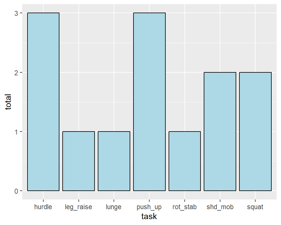
Figure 7.3: A single fill and outline color for all bars
Note In ggplot2, which is the package used for plotting, the default is to use the British spelling, colour, instead of the American spelling, color. Internally, American spellings are remapped to the British ones, so if you use the American spelling it will still work.
7.2 Anatomy of a Graph
There is alot of things that is going on behind the scene in this simple code of ggplot(dat_summ) + geom_col(aes(x = task, y = total)). Let us deleve a little into it, to understand the grammar of any graph, not just the bar graph we created. Remember, for any software, this grammar or anatomy towards a graph will be similar.
7.2.1 Plot Background
To start building the plot, we first specify the data frame that contains the relevant data. Here we are ‘sending the dat_summ data set into the ggplot function’:
# render background
ggplot(data = dat_summ)
Figure 7.4: An empty plot area waiting to be filled
Running this command will produce an empty grey canvas. This is because we not yet specified what variables are to be plotted.
7.2.2 Aesthetics aes()
We can call in different columns of data from dat_summ based on their column names. Column names are given as ‘aesthetic’ elements to the ggplot function, and are wrapped in the aes() function.
Because we want a bar plot, each bar will have an x and a y coordinate. We want the x axis to represent task ( x = task ), and the y axis to represent the total FMS score ( y = total ).
See how the x- and y-axis titles, labels, and tick-marks become populated? But still nothing plotted, and that is because you have not tell it what shapes to plot.

Figure 7.5: Setting the aesthetics
7.2.3 Geometric representations geom()
Now we tell the computer what shapes to plot. Given we want a bar plot, we need to specify that the geometric representation (i.e. shape) of the data will be in the bar form, using geom_col().
Here we are adding a layer (hence the + sign) of points to the plot.
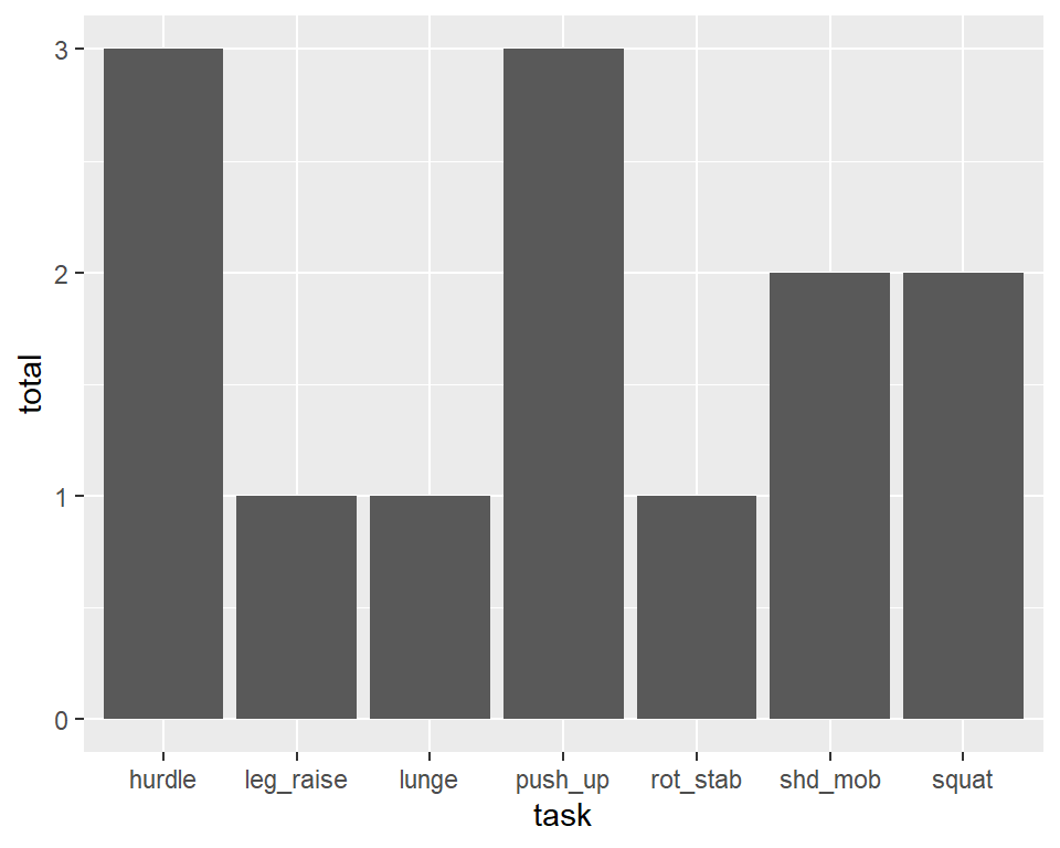
Figure 7.6: Setting the geometric representation
Notice the code difference in Recipe 7.2.3 and Recipe 7.1. I put the aes() inside geom_col() in Recipe 7.1, but inside ggplot () in Recipe 7.2.3. Putting the aes() inside ggplot() means the aesthetic mapping will trickle down to however many layers of plots you want to overlay your figure with. I will not expand further on this to keep this book simple.
7.3 Grouping Bars Together
7.3.2 Solution
Map a variable to fill, and use geom_col(position = "dodge").
In this example we’ll use the athlete_c data set, in which we have an FMS score one for each side.
We’ll map task to the x position and map side to the fill color (Figure 7.7):
Figure 7.7: Graph with grouped bars
Let’s try this example on another dataset dat_grp, in which we have the number of subjects who attain a specific FMS score for each task.
We’ll map task to the x position, count to the y position, and map score to the fill color (Figure 7.8):
ggplot(dat_grp) +
  geom_col(aes(x = task, y = count, fill = score), position = "dodge") +
  scale_fill_discrete(drop=FALSE) +
  scale_x_discrete(drop=FALSE)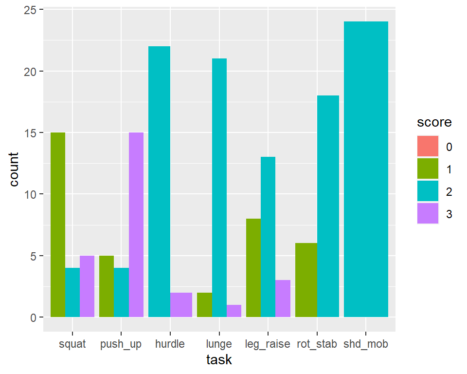
Figure 7.8: Graph with grouped bars
7.3.3 Discussion
The most basic bar graphs have one categorical variable on the x-axis and one continuous variable on the y-axis. Sometimes you’ll want to use another categorical variable to divide up the data, in addition to the variable on the x-axis. You can produce a grouped bar plot by mapping that variable to fill, which represents the fill color of the bars. You must also use position = "dodge", which tells the bars to “dodge” each other horizontally; if you don’t, you’ll end up with a stacked bar plot. Try remove this argument position = "dodge", and see what happens!
As with variables mapped to the x-axis of a bar graph, variables that are mapped to the fill color of bars must be categorical rather than continuous variables.
Other aesthetics, such as colour (the color of the outlines of the bars), can also be used for grouping variables, but fill is probably what you’ll want to use.
7.4 Using Colors in a Bar Graph
7.4.1 Problem
You want to use different colors for the bars in your graph.The default colors aren’t the most appealing, so you may want to set them using scale_fill_manual(). We’ll set the outline color of the bars to black, with colour="black" (Figure 7.9).
7.4.2 Solution
Map the appropriate variable to the fill aesthetic (Figure 7.9).
ggplot(athlete_c) +
  geom_col(aes(x = task, y = score, fill = side), position = "dodge", color = "black") +
scale_fill_manual(values = c("red", "blue", "green")) 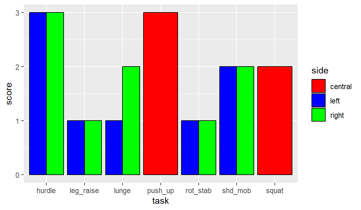
Figure 7.9: Graph with different colors, black outlines, and sorted by percentage change
7.4.3 Discussion
In the variable side, there are three values - c, l, r. How does R know if red is for what value, and ditto for other colors. Well, if you did not specify the levels, it goes in alphabetical order. So "red"” is for c, and "green" is for r. See Recipe 6.6 for how to change the order of levels in a factor. There are plethora of color names that is available in R and that you can select to be used in scale_fill_manual (Figure 7.10).
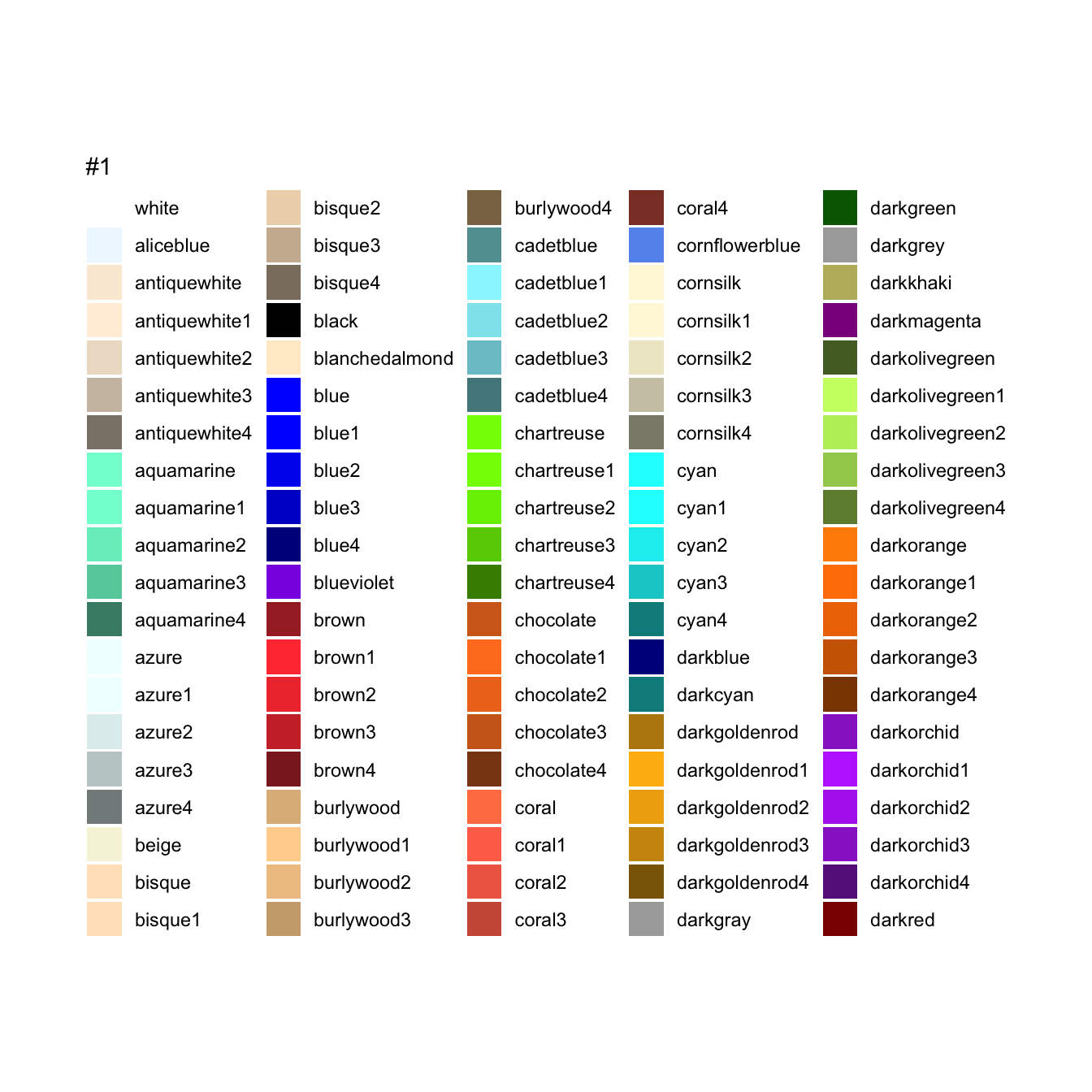
Figure 7.10: Names of many colors available in R.
7.5 Changing Axes titles in a Bar Graph
7.5.1 Problem
You want to use a different name to label each axis. Some may simply want to use the same names with capitalizations, or totally different names, especially if abbreviations are used in your spreadsheet. For this we will be using the labs() function.
7.5.2 Solution
Map the appropriate variable to the fill aesthetic (Figure 7.11).
ggplot(athlete_c) +
  geom_col(aes(x = task, y = score, fill = side), position = "dodge", color = "black") +
  scale_fill_manual(values = c("red", "blue", "green")) +
  labs (x = "Tasks",
        y = "FMS Score")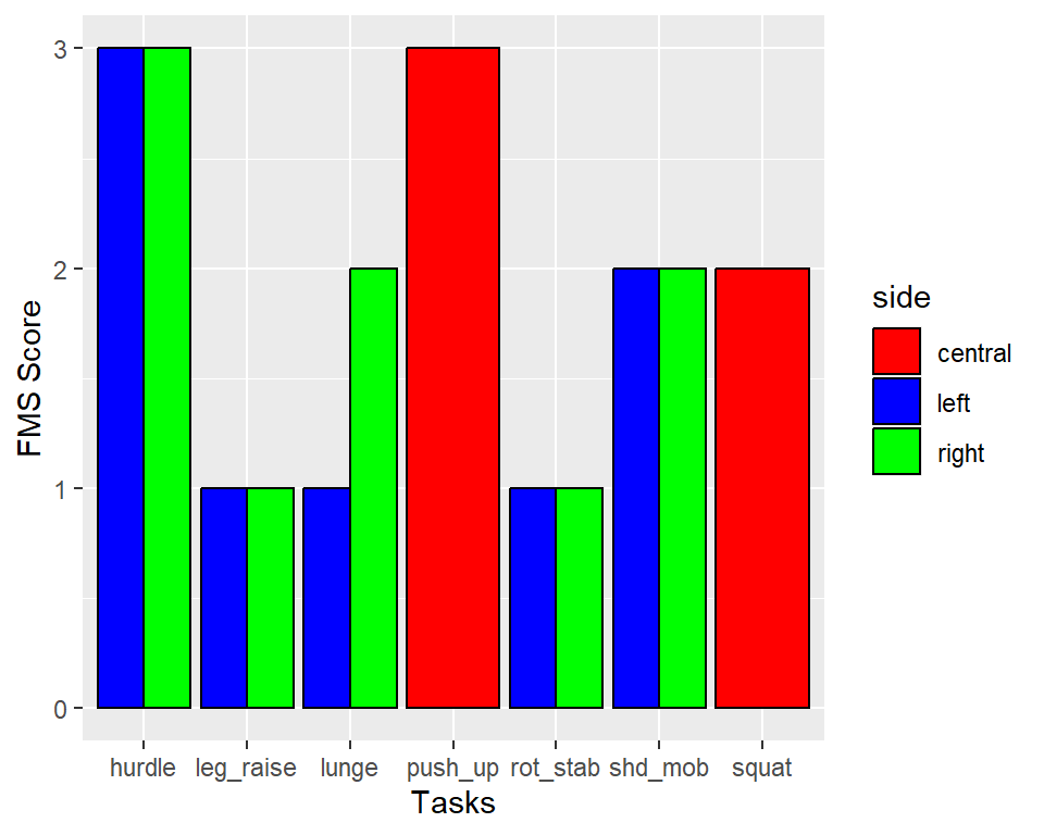
Figure 7.11: Graph different axes titles
7.6 Changing Legend titles in a Bar Graph
7.6.1 Problem
You want to use a different name for the legend title. Some may simply want to use the same names with capitalizations, or totally different names, especially if abbreviations are used in your spreadsheet. For this we will be using the labs() function, and within it the fill argument. In this example, the visual component that separates different sides was the fill color, that is why we changed the name of the fill component.
7.6.2 Solution
Map the appropriate variable to the fill aesthetic (Figure 7.12).
ggplot(athlete_c) +
  geom_col(aes(x = task, y = score, fill = side), position = "dodge", color = "black") +
  scale_fill_manual(values = c("red", "blue", "green")) +
  labs (x = "Tasks",
        y = "FMS Score",
        fill = "Side")
Figure 7.12: Graph different legend title
7.7 Changing font size uniformly across the Bar Graph
7.7.1 Problem
You want to magnify the font size for the axes titles, axes labels, legend title, and legend labels. In this case you can use the theme(text = element_text(size=) function. For advance users which is not convered in this book, you can actually custom the fontsize of each and every component to be different.
7.7.2 Solution
Map the appropriate variable to the fill aesthetic (Figure 7.13).
ggplot(athlete_c) +
  geom_col(aes(x = task, y = score, fill = side), position = "dodge", color = "black") +
  scale_fill_manual(values = c("red", "blue", "green")) +
  labs (x = "Tasks",
        y = "FMS Score",
        fill = "Side") +
  theme(text = element_text(size= 16))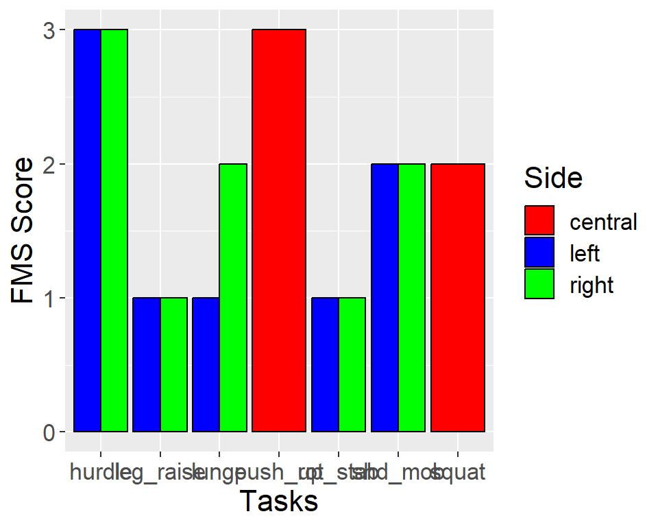
Figure 7.13: Graph with font size = 16
7.8 Outputting to Bitmap (PNG/TIFF) Files
7.8.2 Solution
We will be using ggsave(). First we need to assign the gplot we created with ggplot() to an object, which we can name anything. Here we call the object simply f. There are several important arguments you need. filename is the name of the file and extension you want your image to be called. Here we will use filename = "my_plot.png". plot is the specific figure you want to save. Here we will use plot = f. width and height allows you to specify how big your image is. unit is whether your width and height are defined in centimeters, "cm", or inches, "in". Here I will use units = "cm", and a 8 cm by 4 cm width and height, respectively. Lastly, the dpi argument specifies the resoultion of the image. Here we use dpi = 300. The file is saved to the working directory of the session.
f <- ggplot(athlete_c) +
  geom_col(aes(x = task, y = score, fill = side), position = "dodge", color = "black") +
  scale_fill_manual(values = c("red", "blue", "green")) +
  labs (x = "Tasks",
        y = "FMS Score",
        fill = "Side") +
  theme(text = element_text(size= 16))

# Default dimensions are in inches, but you can specify the unit
ggsave(filename = "myplot.png",
       plot = f, # the name of the image object you created above.
       width = 8,
       height = 8,
       unit = "cm",
       dpi = 300)
7.8.3 Discussion
For high-quality print output, use at least 300 ppi. Figure 7.14 shows portions of the same plot at different resolutions.
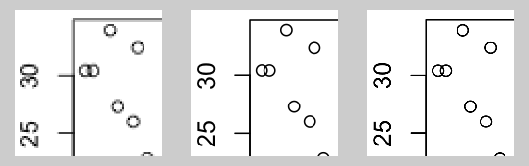
Figure 7.14: From left to right: PNG output at 72, 150, and 300 ppi (actual size)
R supports other bitmap formats, like BMP, TIFF, and JPEG, but there’s really not much reason to use them instead of PNG.
The exact appearance of the resulting bitmaps varies from platform to platform. Unlike R’s PDF output device, which renders consistently across platforms, the bitmap output devices may render the same plot differently on Windows, Linux, and Mac OS X. There can even be variation within each of these operating systems.
7.9 Learning check
Open up your
practice_script.R, updated from the learning check in 6.9.You should already have codes to help you import your files, and process your files.Using the data
athlete_c_longdata, create a barplot athlete C’s FMS score. Make the variabletaskas the x axis, thescoreFMS score as the y axis, and thesideas thefillcolor. See Recipe 7.3.Using the data
fms_countdata, makescorea factor. See Recipe 6.6.Using the data
fms_countdata, create a barplot, where the variabletaskis on the x axis, thecountis on the y axis, and FMSscoreas thefillcolor. See Recipe 7.3.Remember to save your file.
Download the solution to this learning check below.